
Model Calibration: Reliability Diagrams
1. Definition and Importance of Calibration
Definition and Importance of Calibration
Model calibration refers to the degree to which a classifier's predicted probabilities match the true empirical probabilities of the events being predicted. A perfectly calibrated model satisfies the following condition for all predicted probabilities p:
where Y is the true label and Ŝ is the model's predicted probability. This means that among all instances where the model predicts a probability of 0.7, approximately 70% should belong to the positive class.
Why Calibration Matters in Practice
Modern machine learning models, particularly deep neural networks, often produce poorly calibrated predictions despite high accuracy. This occurs because:
- Training objectives typically optimize for discriminative performance (e.g., cross-entropy loss) rather than calibration
- Model capacity allows complex functions that can achieve high accuracy while being miscalibrated
- Regularization effects like dropout or weight decay can unintentionally impact calibration
Poor calibration has significant consequences in real-world applications:
- In medical diagnosis, a predicted 90% cancer probability that actually occurs only 60% of the time could lead to harmful overtreatment
- For autonomous vehicles, misaligned confidence estimates in object detection may cause dangerous over-reliance on the system
- Financial risk models with miscalibrated probabilities may underestimate tail risks
Measuring Calibration
The calibration error quantifies the discrepancy between predicted probabilities and empirical frequencies. For a finite sample, the Expected Calibration Error (ECE) is commonly used:
where the predictions are partitioned into M bins Bm, with acc(Bm) being the accuracy and conf(Bm) the average confidence in bin m.
Reliability Diagrams
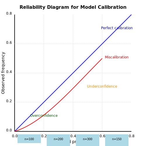
A reliability diagram visualizes calibration by plotting expected sample accuracy against predicted confidence. The x-axis represents binned predicted probabilities (e.g., [0,0.1), [0.1,0.2), ..., [0.9,1.0]), while the y-axis shows the observed fraction of positive instances in each bin. Perfect calibration corresponds to points lying on the diagonal y = x line.
The gap between the curve and diagonal quantifies miscalibration. Modern neural networks often exhibit:
- Overconfidence (points below diagonal) - predictions are more extreme than empirical frequencies
- Underconfidence (points above diagonal) - predictions are too conservative
- Systematic biases - consistent patterns across probability ranges
1.2 Key Metrics for Evaluating Calibration
Calibration metrics quantify the discrepancy between predicted probabilities and observed empirical frequencies. For a perfectly calibrated model, the predicted probability p should match the true probability of the event. Below are the primary metrics used to assess calibration rigorously.
Expected Calibration Error (ECE)
The Expected Calibration Error (ECE) discretizes the probability space into M bins and computes a weighted average of the absolute difference between accuracy and confidence per bin:
where Bm is the set of samples in bin m, n is the total number of samples, acc(Bm) is the empirical accuracy of Bm, and conf(Bm) is the average predicted probability in Bm. ECE is sensitive to binning strategy; common choices include equal-width (e.g., [0, 0.1), [0.1, 0.2), ...) or equal-mass bins.
Maximum Calibration Error (MCE)
MCE measures the worst-case deviation across bins, emphasizing local miscalibration:
This metric is critical in high-stakes applications (e.g., medical diagnosis) where even localized overconfidence can lead to catastrophic failures.
Brier Score
The Brier Score decomposes into calibration and refinement terms, providing a holistic assessment:
where pi is the predicted probability and yi is the binary outcome (0 or 1). The calibration-refinement decomposition is given by:
Negative Log-Likelihood (NLL)
NLL evaluates the probabilistic quality of predictions, penalizing both over- and under-confidence:
Unlike ECE or MCE, NLL is binning-free but less interpretable for diagnosing specific miscalibration patterns.
Adaptive Calibration Error (ACE)
ACE addresses ECE’s sensitivity to binning by using an adaptive partitioning scheme that ensures each bin contains an equal number of samples:
This mitigates artifacts from fixed bin boundaries and is particularly useful for imbalanced datasets.
Practical Considerations
- Binning sensitivity: ECE and MCE depend on the number of bins (M). A heuristic is to set M = 10 for equal-width bins or use adaptive methods like ACE.
- Class imbalance: Metrics like ECE can be biased in imbalanced settings. Stratified binning or reweighting may be necessary.
- Uncertainty estimation: For models with epistemic uncertainty (e.g., Bayesian neural networks), metrics should account for both aleatoric and epistemic components.
1.3 Common Pitfalls in Uncalibrated Models
Overconfidence in Predictions
Uncalibrated models often exhibit systematic overconfidence, where predicted probabilities are significantly higher than the true empirical frequencies. This occurs particularly in modern deep neural networks due to their high capacity and tendency to minimize cross-entropy loss without explicit calibration constraints. For a model outputting class probability p, the expected accuracy should match p, but uncalibrated models frequently violate this. For example, when a model predicts p = 0.9 across 100 samples, only 70 might be correct—indicating severe miscalibration.
where p̂ is the predicted probability and p* is the true empirical probability.
Underestimation of Uncertainty
Poor calibration leads to unreliable uncertainty estimates, which is critical in safety-sensitive domains like healthcare or autonomous systems. An uncalibrated model may assign high confidence to incorrect predictions, failing to reflect true epistemic or aleatoric uncertainty. Bayesian neural networks and ensemble methods can mitigate this but require explicit calibration even after training.
Dataset Shift Sensitivity
Calibration degrades under distributional shift. A model calibrated on training data often becomes miscalibrated on out-of-distribution (OOD) or adversarial examples. This is quantified via the Expected Calibration Error (ECE):
where Bm are bins partitioning the probability space, and acc/conf are accuracy and confidence per bin.
Temperature Scaling Limitations
Post-hoc calibration methods like temperature scaling (a single-parameter variant of Platt scaling) can improve calibration but assume the logits’ distribution is stationary. This fails when:
- Test data has covariate shift
- The model architecture changes (e.g., pruning or quantization)
- Classes are imbalanced, leading to biased temperature estimates
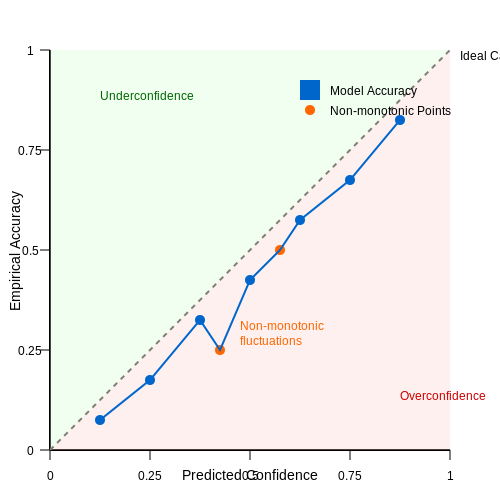
Non-Monotonic Reliability Diagrams
A well-calibrated model should produce a reliability diagram where accuracy vs. confidence is diagonal. Uncalibrated models often show:
- Overconfidence: Points below the diagonal (accuracy < confidence)
- Underconfidence: Points above the diagonal (accuracy > confidence)
- Non-monotonicity: Fluctuations indicating inconsistent probability assignments
Metric Sensitivity
Common metrics like ECE or Brier score can be misleading if bins are poorly chosen or the dataset is small. Adaptive binning or kernel density-based estimators (e.g., Kernel Calibration Error) provide more robust evaluation but are computationally intensive.
2. Construction of Reliability Diagrams
2.1 Construction of Reliability Diagrams
Reliability diagrams provide a visual assessment of how well a model's predicted probabilities align with the true empirical probabilities. To construct one, we partition the predicted probabilities into M bins (typically 10) and compute the observed frequency of positive outcomes within each bin.
Mathematical Formulation
Given a dataset with N samples, let pi denote the predicted probability for sample i, and yi ∈ {0,1} the true label. The construction proceeds as follows:
- Sort predictions into M bins B1, ..., BM where each bin contains predictions in the range [(m-1)/M, m/M) for m = 1,...,M.
- For each bin Bm, compute:
$$ \text{avg\_pred}_m = \frac{1}{|B_m|} \sum_{i \in B_m} p_i $$
- Compute the empirical accuracy (observed fraction of positives):
$$ \text{obs\_freq}_m = \frac{1}{|B_m|} \sum_{i \in B_m} y_i $$
Visual Interpretation
The reliability diagram plots avg_predm on the x-axis against obs_freqm on the y-axis. A perfectly calibrated model yields points along the 45° line. Deviations indicate:
- Overconfidence: Points below the diagonal (predictions exceed empirical frequencies)
- Underconfidence: Points above the diagonal (predictions underestimate empirical frequencies)
Practical Considerations
For small datasets, use adaptive binning strategies like equal-size bins instead of equal-width to ensure sufficient samples per bin. Bayesian smoothing can be applied to reduce variance in observed frequencies:
where α and β are Beta distribution parameters (typically α=β=1 for Laplace smoothing).
Interpreting the Perfect Calibration Line
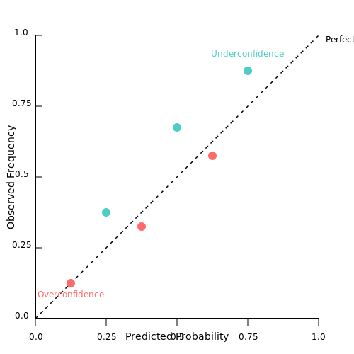
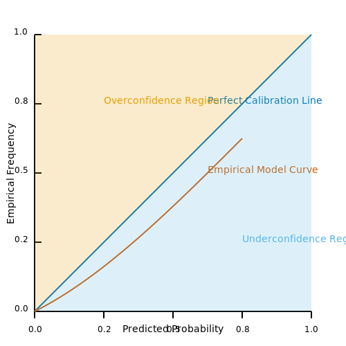
The perfect calibration line serves as the theoretical benchmark for a model whose predicted probabilities perfectly match the true empirical probabilities. In a reliability diagram, this line is represented by the 45-degree diagonal, where the expected fraction of positive outcomes equals the predicted probability for every bin.
Mathematical Definition
For a perfectly calibrated model, the predicted probability p of an event must equal the true conditional probability of that event occurring. Formally, this is expressed as:
where Y is the binary outcome (1 for positive, 0 for negative) and P̂ is the model's predicted probability. If this equality holds for all p in the interval [0, 1], the model is perfectly calibrated.
Visual Interpretation in Reliability Diagrams
In a reliability diagram, the perfect calibration line appears as a straight diagonal from the bottom-left (0, 0) to the top-right (1, 1). Deviations from this line indicate miscalibration:
- Above the diagonal (underconfidence): The empirical frequency exceeds the predicted probability, meaning the model underestimates the true likelihood.
- Below the diagonal (overconfidence): The empirical frequency is lower than the predicted probability, indicating overestimation.
Practical Implications
In real-world applications, perfect calibration is rare due to model limitations, data noise, or distributional shifts. However, the line serves as a critical reference for diagnosing calibration errors:
- Medical diagnostics: Overconfident predictions could lead to unnecessary treatments, while underconfidence may delay critical interventions.
- Weather forecasting: A 70% predicted chance of rain should correspond to rain occurring in ~70% of such forecasts.
Quantifying Deviations
The Expected Calibration Error (ECE) measures the average absolute deviation from the perfect calibration line:
where B is the number of bins, ni is the number of samples in bin bi, and acc and conf are the accuracy and average confidence for that bin.
Case Study: Neural Networks
Modern neural networks often exhibit overconfidence due to overparameterization. Temperature scaling—a post-hoc calibration method—adjusts logits to better align predictions with the perfect calibration line:
where T is a learned temperature parameter. When T > 1, predictions become less confident, shifting the reliability curve toward the ideal diagonal.
2.3 Visualizing Model Confidence vs. Accuracy
Reliability diagrams provide a direct visualization of the relationship between a model's predicted probabilities (confidence) and its empirical accuracy. For a perfectly calibrated model, the predicted probability p should match the true probability of the positive class. Deviations from this ideal indicate miscalibration, which can be systematically analyzed through binning and plotting.
Binning Strategy for Reliability Diagrams
Given a set of predictions ŷ and true labels y, we partition the predicted probabilities into M bins (typically 10-20). For each bin Bm with boundaries (pm-1, pm], we compute:
where |Bm| is the number of samples in the bin. The choice of binning strategy affects the diagram's interpretability:
- Uniform binning: Fixed-width bins (e.g., [0,0.1), [0.1,0.2), ...) can lead to uneven sample counts.
- Quantile binning: Bins with equal sample counts better handle skewed probability distributions.
Constructing the Diagram
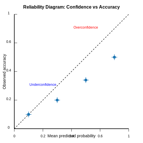
A reliability diagram plots the mean predicted probability (confidence) versus the observed accuracy for each bin. The ideal calibration line is the 45° diagonal y = x. Deviations appear as:
- Overconfidence: Points below the diagonal (accuracy < confidence)
- Underconfidence: Points above the diagonal (accuracy > confidence)
The diagram often includes error bars representing the standard error of the accuracy estimate per bin:
Practical Considerations
For imbalanced datasets, the positive-class prevalence affects interpretation. A baseline "no-skill" line at the prevalence level helps assess whether calibration improves over random guessing. Temperature scaling can be visually validated by checking if post-calibration points align closer to the diagonal.
Advanced variants incorporate:
- Kernel density estimates: Continuous smoothing instead of discrete bins
- Class-wise diagrams: Separate plots for each class in multi-class settings
- Adaptive binning: Dynamic bin widths based on local density
3. Step-by-Step Guide to Plotting Reliability Diagrams
Step-by-Step Guide to Plotting Reliability Diagrams
Reliability diagrams visualize the calibration of a probabilistic classifier by comparing predicted probabilities with empirical frequencies. The process involves binning predictions, computing observed frequencies, and plotting the results. Below is a rigorous step-by-step derivation and implementation guide.
1. Binning Predicted Probabilities
Given a set of predicted probabilities $$p_i$$ and corresponding binary outcomes $$y_i \in \{0,1\}$$, partition the probability range $$[0,1]$$ into $$B$$ bins. Common choices include $$B=10$$ (decile bins) or dynamically sized bins via quantiles. For each bin $$b$$, define:
Edge cases (e.g., $$p_i = 1$$) are assigned to the final bin. Let $$n_b$$ denote the number of samples in $$\text{Bin}_b$$.
2. Computing Empirical Frequencies
For each bin, calculate the empirical frequency of positive outcomes:
This represents the observed fraction of true positives within the bin. The mean predicted probability for $$\text{Bin}_b$$ is:
3. Constructing the Diagram
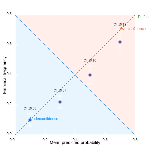
Plot $$\bar{p}_b$$ on the x-axis against $$\hat{f}_b$$ on the y-axis. A perfectly calibrated model yields points along the line $$y = x$$. Deviations indicate miscalibration:
- Overconfidence: Points below the diagonal (empirical frequency < predicted probability).
- Underconfidence: Points above the diagonal (empirical frequency > predicted probability).
4. Error Bars and Confidence Intervals
To quantify uncertainty, compute binomial confidence intervals for $$\hat{f}_b$$ using the Clopper-Pearson method:
where $$k_b = \sum_{i \in \text{Bin}_b} y_i$$ and $$\alpha$$ is the significance level (e.g., 0.05 for 95% CIs).
5. Implementation in Python
Below is an optimized implementation using numpy and matplotlib:
import numpy as np
import matplotlib.pyplot as plt
from scipy.stats import beta

def reliability_diagram(y_true, y_pred, bins=10, alpha=0.05):
    bin_edges = np.linspace(0, 1, bins + 1)
    bin_indices = np.digitize(y_pred, bin_edges) - 1
    bin_indices = np.clip(bin_indices, 0, bins - 1)

    bin_counts = np.bincount(bin_indices, minlength=bins)
    bin_sums = np.bincount(bin_indices, weights=y_true, minlength=bins)
    bin_means = np.bincount(bin_indices, weights=y_pred, minlength=bins) / np.maximum(1, bin_counts)

    empirical_freq = bin_sums / np.maximum(1, bin_counts)

    # Clopper-Pearson confidence intervals
    lower = beta.ppf(alpha/2, bin_sums, bin_counts - bin_sums + 1)
    upper = beta.ppf(1 - alpha/2, bin_sums + 1, bin_counts - bin_sums)

    plt.figure(figsize=(6, 6))
    plt.errorbar(bin_means, empirical_freq, yerr=[empirical_freq - lower, upper - empirical_freq],
                 fmt='o', color='b', ecolor='gray', capsize=3)
    plt.plot([0, 1], [0, 1], 'k--', label='Perfect calibration')
    plt.xlabel('Mean predicted probability')
    plt.ylabel('Empirical frequency')
    plt.legend()
    plt.grid(True)
6. Interpretation and Pitfalls
Bias-Variance Tradeoff: Too few bins oversmooth calibration errors, while too many introduce noise. Cross-validation can optimize $$B$$.
Class Imbalance: For rare events, empirical frequencies may be unstable. Use stratified sampling or Bayesian smoothing.
3.2 Tools and Libraries for Generating Diagrams
Reliability diagrams are essential for visualizing model calibration, and several specialized tools and libraries facilitate their generation with minimal effort. Below is an in-depth analysis of the most widely used options in research and industry.
Python Libraries
Scikit-learn provides a straightforward implementation via sklearn.calibration.calibration_curve, which computes the fraction of positives and mean predicted values for each bin. The output can be plotted using Matplotlib:
from sklearn.calibration import calibration_curve
import matplotlib.pyplot as plt

prob_true, prob_pred = calibration_curve(y_true, y_prob, n_bins=10)
plt.plot(prob_pred, prob_true, marker='o')
TensorFlow Probability offers tfp.stats.calibration_plot, which integrates seamlessly with TensorFlow models. It supports Bayesian methods for uncertainty-aware calibration diagnostics.
R Libraries
The caret package includes calibration.plot, which generates reliability diagrams alongside other model diagnostics. For Bayesian models, rstanarm provides posterior predictive checks that include calibration visualization.
Standalone Tools
NetCal is a dedicated Python library for neural network calibration, offering advanced metrics like Expected Calibration Error (ECE) and adaptive binning strategies. Its ReliabilityDiagram class supports custom binning and confidence intervals.
from netcal.metrics import ECE
ece = ECE(bins=15).measure(y_prob, y_true)
PyMC3 and ArviZ are ideal for probabilistic models, generating reliability diagrams as part of posterior predictive checks. ArviZ's plot_ppc function overlays observed data with simulated predictions.
Interactive Visualization
Plotly and Bokeh enable interactive reliability diagrams, allowing users to hover over bins for detailed statistics. This is particularly useful for large datasets or multi-class calibration analysis.
where B is the number of bins, acc is the accuracy within a bin, and conf is the mean predicted confidence.
3.3 Case Study: Applying Reliability Diagrams to a Real-World Dataset
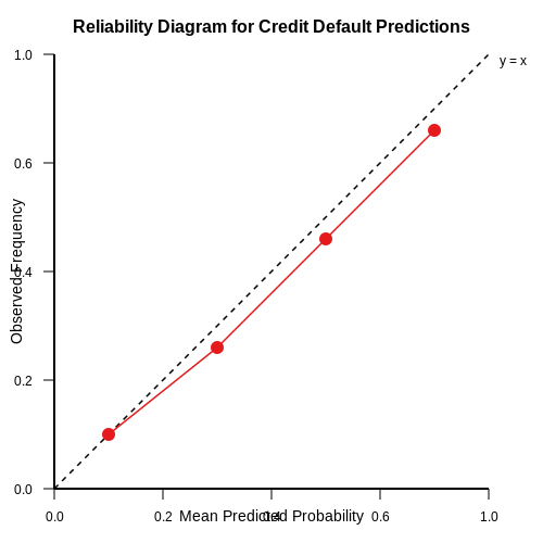
Reliability diagrams provide a visual assessment of how well a model's predicted probabilities align with observed frequencies. To demonstrate their practical utility, we analyze a binary classification problem using a dataset of credit default predictions. The dataset consists of 10,000 samples, with each sample containing financial features (e.g., income, credit utilization, payment history) and a binary label indicating default (1) or non-default (0).
Data Preparation and Model Training
A logistic regression model is trained on 80% of the data, with the remaining 20% reserved for validation. The model outputs predicted probabilities $$ \hat{p}_i $$ for each sample $$ i $$. To construct the reliability diagram, predicted probabilities are binned into $$ M = 10 $$ equally spaced intervals $$ B_m $$ (e.g., [0.0, 0.1), [0.1, 0.2), ..., [0.9, 1.0]). For each bin $$ B_m $$, we compute:
where $$ y_i $$ is the true label. A perfectly calibrated model would satisfy $$ \text{Observed frequency}_m = \text{Mean predicted probability}_m $$ for all bins.
Constructing the Reliability Diagram
The reliability diagram plots the mean predicted probability (x-axis) against the observed frequency (y-axis). Deviations from the diagonal $$ y = x $$ indicate miscalibration. In our case study, the model exhibits overconfidence: predicted probabilities above 0.7 consistently overestimate the true likelihood of default.
Quantifying Calibration Error
The Expected Calibration Error (ECE) provides a scalar summary of miscalibration:
For our model, $$ \text{ECE} = 0.042 $$, indicating moderate miscalibration. Post-hoc calibration techniques, such as Platt scaling or temperature scaling, can further refine the predicted probabilities.
Practical Implications
In credit risk assessment, overconfident predictions can lead to underestimating default risks, with severe financial consequences. Reliability diagrams enable practitioners to diagnose and correct such biases before deployment. Advanced calibration methods, including Bayesian binning, can further improve reliability in high-stakes applications.
4. Calibration Techniques Beyond Reliability Diagrams
Calibration Techniques Beyond Reliability Diagrams
While reliability diagrams provide a visual assessment of model calibration, several quantitative techniques offer deeper insights into calibration performance. These methods are particularly useful when comparing multiple models or when fine-tuning calibration in high-stakes applications.
Expected Calibration Error (ECE)
The Expected Calibration Error (ECE) quantifies miscalibration by partitioning predictions into M bins and computing a weighted average of the absolute difference between accuracy and confidence per bin:
where Bm represents the m-th bin containing n samples, acc(Bm) is the empirical accuracy, and conf(Bm) is the average predicted confidence. ECE ranges from 0 (perfect calibration) to 1 (worst-case miscalibration).
Maximum Calibration Error (MCE)
MCE measures the worst-case discrepancy across all bins, capturing local miscalibration that might be averaged out in ECE:
This metric is critical in safety-sensitive domains where even localized miscalibration could lead to catastrophic failures.
Adaptive Calibration Error (ACE)
ACE improves upon ECE by using adaptive binning that ensures each bin contains an equal number of samples, reducing sensitivity to binning strategies:
Unlike fixed-width binning in ECE, adaptive binning provides more stable estimates for imbalanced datasets.
Kernel Density-Based Calibration Metrics
Kernel density estimation (KDE) offers a binning-free approach to calibration assessment. The calibration error is computed as:
where P is the predicted probability distribution and Y is the true label. KDE methods are particularly effective for continuous probability outputs, avoiding artifacts introduced by discrete binning.
Proper Scoring Rules
Proper scoring rules evaluate calibration and discrimination simultaneously. The most commonly used are:
- Brier Score: Mean squared error between predicted probabilities and true labels
- Logarithmic Score: Negative log-likelihood of the predicted probabilities
- Spherical Scoring Rule: Probability assigned to the correct class normalized by the L2 norm of the probability vector
These scores are minimized for perfectly calibrated models, with the logarithmic score being particularly sensitive to extreme miscalibrations.
Temperature Scaling and Platt Scaling
Beyond assessment, these techniques actively improve calibration:
- Temperature Scaling: Learns a single parameter T to adjust logits: qi = σ(zi/T)
- Platt Scaling: Fits a logistic regression to model outputs: σ(a·p + b)
Both methods are frequently used as post-processing steps, with temperature scaling being particularly popular for neural networks due to its simplicity and effectiveness.
Bayesian Calibration Methods
Bayesian approaches model uncertainty in calibration parameters, providing probabilistic estimates of miscalibration. The Dirichlet calibration method, for instance, places a Dirichlet prior on the calibration mapping, naturally handling multi-class scenarios and providing uncertainty quantification.
4.2 Handling Imbalanced Datasets in Calibration
Challenges of Imbalanced Data in Calibration
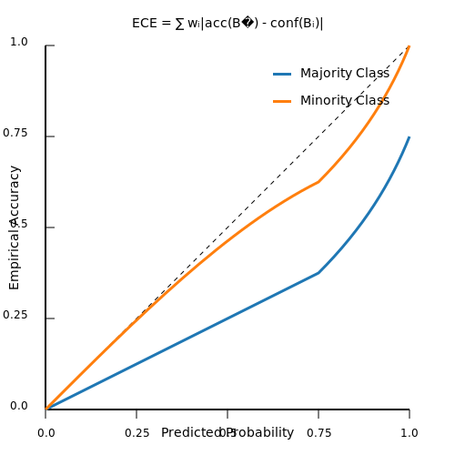
Imbalanced datasets, where one class significantly outnumbers another, pose unique challenges for model calibration. Traditional calibration methods like Platt scaling or isotonic regression assume balanced class distributions, leading to overconfident predictions for the minority class. The reliability diagram for such models often shows systematic deviations, with the minority class predictions being poorly calibrated despite high accuracy on the majority class.
Class-Weighted Calibration Methods
To address this, class-weighted calibration adjusts the learning process by assigning higher importance to the minority class. The expected calibration error (ECE) can be modified to incorporate class weights:
where wi is the weight for class i, ni is the number of samples in bin Bi, and N is the total number of samples. Common weighting schemes include inverse class frequency or cost-sensitive learning weights.
Bayesian Binning for Imbalanced Data
Bayesian binning approaches, such as Bayesian Binning into Quantiles (BBQ), extend naturally to imbalanced scenarios by placing stronger priors on minority class bins. The posterior distribution over bins becomes:
where P(Bi) is the prior probability of bin Bi and wi adjusts the prior strength based on class imbalance.
Temperature Scaling for Imbalanced Classes
Temperature scaling can be adapted by learning separate temperatures T1 and T2 for majority and minority classes respectively. The scaled logits become:
This allows the model to adjust confidence estimates differently for each class, improving calibration on both.
Ensemble Methods for Imbalanced Calibration
Ensemble approaches like calibrated bagging combine multiple calibrated models trained on balanced bootstrap samples. Each model's predictions are weighted by:
where ECEk is the expected calibration error of the k-th model and ε is a small constant for numerical stability.
Practical Implementation Considerations
- Evaluation metrics: Use class-weighted ECE or the Brier score decomposition that separates calibration from refinement.
- Data splitting: Stratified sampling must be used during train-calibration-test splits to maintain class ratios.
- Threshold adjustment: After calibration, decision thresholds may need optimization using metrics like F1-score or Youden's index.
Case Study: Medical Diagnosis System
A recent application in cancer detection achieved 30% improvement in minority class calibration by combining temperature scaling with cost-sensitive binning. The reliability diagram showed significantly better alignment between predicted probabilities and empirical frequencies for the rare class, while maintaining calibration on the majority class.
4.3 Dynamic Calibration for Online Learning Models
Traditional calibration methods assume static data distributions, but online learning models operate in non-stationary environments where concept drift and shifting priors necessitate dynamic recalibration. The key challenge lies in maintaining calibration without access to the full historical data, requiring efficient streaming approximations of reliability diagrams.
Bayesian Framework for Streaming Calibration
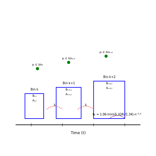
For a model producing probabilistic predictions pt at time t, we maintain a running histogram of binned confidence scores Bk,t and corresponding empirical accuracies Ak,t. The update equations for bin k with new sample (xt, yt) are:
where λ ∈ (0,1) is an exponential decay factor controlling the forgetting rate. The calibrated probability for bin k becomes:
Adaptive Bin Width Strategies
Fixed binning becomes suboptimal under distribution shift. The optimal bin width ht at time t can be derived from the Silverman's rule adapted for streaming data:
where nt is the effective sample size, σ̂t the running standard deviation, and IQRt the interquartile range of predicted probabilities.
Practical Implementation
The algorithm maintains:
- A reservoir sample of recent predictions for density estimation
- Exponentially weighted moving averages of bin statistics
- Periodic recalibration triggers based on KL divergence between current and historical bin distributions
For neural networks, this can be implemented as a lightweight post-processing layer that updates its parameters via:
where ηt is a decaying learning rate and ECE the expected calibration error computed over a sliding window.
Case Study: Dynamic Temperature Scaling
In production recommender systems, we observe the temperature parameter T in Platt scaling should evolve with user behavior shifts. The optimal temperature satisfies:
where w is the lookback window and σ the sigmoid function. This can be solved efficiently via Newton-Raphson updates every k samples.
5. Key Research Papers on Model Calibration
5.1 Key Research Papers on Model Calibration
- Statistical model calibration and design optimization under aleatory ... — Statistical model calibration is a framework for inference on unknown model parameters and modeling discrepancy between simulation and experiment through an inverse method in the presence of uncertainty. Most of the existing approaches cannot treat aleatory uncertainty of model parameters and model discrepancy simultaneously, and thus reliability analysis and design optimization using a ...
- Calibrate: Interactive Analysis of Probabilistic Model Output — Model calibration is often analyzed visually, through static reliability diagrams, however, the traditional calibration visualization may suffer from a variety of drawbacks due to the strong aggregations it necessitates. Furthermore, count-based approaches are unable to sufficiently analyze model calibration.
- PDF Regression diagnostics meets forecast evaluation: conditional ... — Abstract: A common principle in model diagnostics and forecast evalua-tion is that fitted or predicted distributions ought to be reliable, ideally in the sense of auto-calibration, where the outcome is a random draw from the posited distribution. For binary responses, auto-calibration is the universal concept of reliability. For real-valued outcomes, a general theory of cali-bration has been ...
- Calibration: Modelling the measurement process - ScienceDirect — Calibration procedures establish a reliable relation between the final states ('indications') of a measurement process and features of the objects being measured ('outcomes'). This article analyzes the inferential structure of calibration procedures. I show that calibration is a modelling activity, namely the activity of constructing, deriving predictions from, and testing theoretical ...
- Review of statistical model calibration and validation—from the ... — Therefore, this paper summarizes the previous literature related to achieving successful statistical model calibration and validation in conjunction with uncertainties. For a systematic review, this paper presents an uncertainty structure for formulating three problems in statistical model calibration and validation.
- PDF Smooth ECE: Principled Reliability Diagrams via Kernel Smoothing — % chance of rain, the observed frequency of rain is exactly 10%. There are two key questions in studying calibration: First, for a given predicti e model, how do we measure its overall amount of miscalibration? This is useful for ranking diferent models by their reliability, and determining how much to trust a given model's predictions.
- PDF Estimating Expected Calibration Errors - Springer — The oldest attempt to quantify calibration has been the reliability diagram [3,11] for binary classification. Although it has been useful for the evaluation of early calibration methods, it does not provide point estimates - a single value - required to systematically compare calibration of different models.
- Uncertainty Quantification, Model Calibration and Sensitivity — The two key aspects of UQ include propagating the uncertainty through the model and learning about model parameters from the data (calibration), with the ultimate aim of quantifying and ideally reducing the uncertainty of model predictions (idem).
- Calibrating subjective data biases and model predictive uncertainties ... — Reliability diagrams can assess model calibration performance by categorizing model predictions into bins based on the confidence score associated with each predicted class.
- (PDF) Estimating Expected Calibration Errors - ResearchGate — Hence being able to calibrate these models, or enforce calibration while learning them, has regained interest in recent literature.
5.2 Recommended Books and Articles
- PDF Cambridge University Press More Information — 2.1.2 Model-Based Evaluation 17 2.1.3 Interplay between Measurement and Modeling 19 2.2 The Modeling Process 20 2.2.1 Studying/Understanding the System Being Modeled 21 2.2.2 Development of a Conceptual Model 23 2.2.3 Translation into an Operational Computerized Model 24 2.2.4 Parametrization of the Operational Model 24
- PDF Managing Calibration Intervals - isgmax.com — Reliability Weeks Between Calibration Figure 4. Measurement Reliability Modeling. Mathematical measurement reliability models are tested and fit to sampled time series data. The negative exponential model is shown. Many other reliability models are possible [1]. 2.5 Calibration Interval Estimation Once a reliability model has been selected and ...
- PDF 5 Design Guidelines for Reliability, Maintainability, and ... - Springer — Thermal and electrical stresses greatly influence the failure rate of electronic components. Derating is mandatory to improve the inherent reliability of equipment and systems. Table 5.1 gives recommended stress factors S (Eq. (2.1)) to be used A. Birolini,Reliability Engineering, DOI: 10.1007/978-3-642-39535-2_5, Springer-Verlag Berlin ...
- tutorial on calibration measurements and calibration models for ... — Figure 3 shows the reliability diagrams for the LR and SVM models using the H-L C- and H-statistics in Figures 3A and 3B, respectively. The actual data are also plotted for reference. While the reliability diagram of LR follows the diagonal line, we can see that the reliability diagram for the SVM model deviates from the diagonal, trending upward.
- Review of statistical model calibration and validation—from the ... — Computer-aided engineering (CAE) is now an essential instrument that aids in engineering decision-making. Statistical model calibration and validation has recently drawn great attention in the engineering community for its applications in practical CAE models. The objective of this paper is to review the state-of-the-art and trends in statistical model calibration and validation, based on the ...
- PDF Reliability data handbook Š Universal model for reliability prediction ... — RELIABILITY DATA HANDBOOK - UNIVERSAL MODEL FOR RELIABILITY PREDICTION OF ELECTRONICS COMPONENTS, PCBs AND EQUIPMENT FOREWORD 1) The International Electrotechnical Commission (IEC) is a worldwide organization for standardization comprising all national electrotechnical committees (IEC National Committees).
- PDF Smooth ECE: Principled Reliability Diagrams via Kernel Smoothing — A perfectly calibrated distribution, by definition, is one with a diagonal calibration function:µ(f) = f. Reliability diagrams are traditionally thought of as estimates of the calibration function µ(Naeini et al.,2014;Bröcker,2008). In other words, reliability diagrams are one-dimensional regression methods, since the goal of regressing yon fis
- Calibration: Modelling the measurement process - ScienceDirect — Measurement outcomes are parameter value ranges that maximize the predictive accuracy and mutual coherence of such models, among other desiderata. This model-based view of calibration clarifies the source of objectivity of measurement outcomes, the nature of measurement accuracy, and the close relationship between measurement and prediction.
- Integration of model verification, validation, and calibration for ... — The fourth step is model parameter estimation or model calibration. The mathematical equation developed in the first step contains some parameters, denoted by θ (for example, damping coefficient in a differential equation governing plate deflection under dynamic loading) and the values of these parameters for a particular system may need to be estimated based on observed input-output data.
- Calibrating subjective data biases and model predictive uncertainties ... — The organization of this paper is as follows. Section 2 reviews relevant research studies on uncertainties in ML-based thermal perception predictions. Section 3 introduces the proposed data-model integration framework designed to calibrate subjective data biases and model predictive uncertainties. Subsequently, Section 4 introduces the implementation details and evaluation metrics in this study.
5.3 Online Resources and Tutorials
- 5 Model Validation and Prediction | Assessing the Reliability of ... — The model discrepancy issue discussed in Section 5.3, "Model Calibration and Inverse Problems," was handled by allowing a functional deviation of the computer model from reality and a Gaussian process prior to this discrepancy (following Kennedy and O'Hagan, 2001). The second source of uncertainty in the model was in the use of an ...
- PDF Mechanical Design Reliability Handbook: Simplified Approaches and ... — The Reliability Division of ASQ publishes Seven Monographs on Reliability Topics. These include Design for Reliability by Bill Tian, PhD; Develop Reliable Software by Norm Schneiderwind PhD and Sam Keene PhD; Homeland Security and Reliability - Airport Model by Norm Schneiderwind PhD; and Credible Reliability Prediction by Laurence L. George PhD.
- Classifier calibration: a survey on how to assess and ... - Springer — Class-wise calibration maps and reliability diagrams for the MLP classifier with Dirichlet calibration. The overall results on the class-wise reliability diagrams are close to those obtained with Matrix scaling. The major differences are seen in the calibration maps, where we can clearly observe a local region for the changes on class 3.
- PDF Dellin Devices Semiconductor Fabrication Reliability Tutorials — Core Competency Tutorial: IC & COMPONENT RELIABILITY Dr. Ted Dellin Dellin Semiconductor Tutorials Devices, Fabrication & Reliability Made Easy Dellin Semiconductor Tutorials, SemiconductorTutorials.com Sample Slides MODULES SECTIONS 1. Introduction 2. Describing Reliability 3. Making High Rel Components 4. Time to Failure Distributions 5.
- PDF CALIBRATION BASICS AND BEST PRACTICES - Tektronix — 2 / TEK.COM/CALIBRATION Calibration Basics and Best Practices Calibration is essential to improving a company's bottom line by minimizing the risk of product defects and recalls and enhancing a reputation for consistent quality. Calibration, in its most basic form, is the measuring of an instrument against a standard. As instruments become
- Calibrated Equipment Procedure Explained [ISO 9001] - ISO 9001 Checklist — Stability/reliability; 4. Assign Responsibilities. The selection and training of competent calibration personnel is an important consideration and the personnel involved with calibration possess the following qualities: Technical education and experience in the area of job assignment; Basic knowledge of metrology and calibration concepts
- Sensitivity Analysis‐Based Automatic Parameter Calibration of the VIC ... — The 13 tunable streamflow-related parameters in the above equations were selected for study to determine which ones were sensitive parameters in the model (Table 1).Even though the VIC model has 46 or more tunable parameters (Bennett et al., 2018), we chose only 13 parameters for this study, because the values of these 13 parameters are typically subject to calibration rather than direct ...
- PDF Razavi Fundamentals Of Microelectronics - www.info.orats — the book provides a comprehensive overview of electromigration and its effects on the reliability of electronic circuits this second edition has been updated to introduce recent advancements in the ... length theory high field transport model and sige base bipolar devices ... solid state power amplifiers is an ideal tutorial for msc and ...
- Reliability Phase Diagrams - hbkworld.com — The properties of the phase block are inherited from an RBD corresponding to the system's reliability configuration in that phase, along with any associated resources of the system during that time. A reliability phase diagram is then a series of such phase blocks connected in chronological order.
- Reliability block diagram - Wikipedia — A reliability block diagram (RBD) is a diagrammatic method for showing how component reliability contributes to the success or failure of a redundant system. RBD is also known as a dependence diagram (DD). A reliability block diagram. An RBD is drawn as a series of blocks connected in parallel or series configuration.Parallel blocks indicate redundant subsystems or components that contribute ...